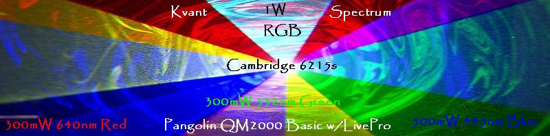
Are you sure the Prism is outputting the color in the right order? Blue is top in the sample logos.. where I think it's supose to be red on top
And of couse we've already done that logo in Lasers
in all it's 100+ Watts of glory!

 Senior Member
Are you sure the Prism is outputting the color in the right order? Blue is top in the sample logos.. where I think it's supose to be red on top
And of couse we've already done that logo in Lasers
in all it's 100+ Watts of glory!
Senior Member
That...is...amazing... That wouldn't happen to be part of the truckload of stuff you are looking to get rid of is it?!
Senior Member
nope it just landed in the UK yesterday for Roger Water's short tour this year..
Originally Posted by DZ

Senior Member
Well that is a very nice setup indeed. I'd love to see that in person someday.
Regarding the logo design, yeah figured out the problem just after it was submitted. I think some folks wanted to keep it that way, however I think it needs to be changed before for it gets embroidered...
Senior Member
The guy who "designed" or helped design that "prism" was at the LDSI conference I went to late last year. I think it was last year. He was up in the "Pangolin" room upstairs and explained the whole set up they used on the RW tour. It looks very nice on the video he showed.
Love, peace, and grease,
allthat... aka: aaron@pangolin
Senior Member
Yes, that was George Dodworth the Owner of Lightwave International and the Prism. He is on Tour with Roger Waters with the prism as we speak. Everyone in the laser show biz was beating him up that week, it was kinda funny.

 Posting Permissions


 Reply With Quote